This project has driven me to the brink, but we’re just about there now. We’re in the home stretch!
Last time, we struggled to integrate text into [piet-cosmic-text] and therefore piet-hardware. This time, it all ends. We have six samples left to go by my count, so it’s time to get cracking.
Number 15: Clipping Caper
Let’s skip right to the end, shall we? The ones between 12 and 15 are all text-related, and I’ve already had my fill of that. This sample is used to test clipping masks, which I’m already aware is a particular pain point for piet-hardware.
Here is the reference image from piet-cairo:
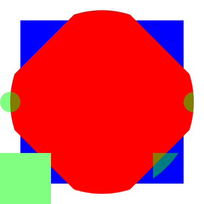
Here is our image:
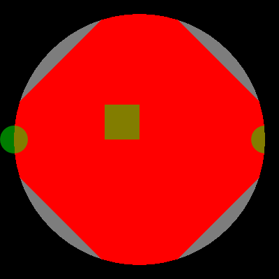
Looks like the clipping is happening improperly… is it drawing the clip rectangle directly on top of the image?
First off, the first issue is that clipping and transforms don’t affect clear, which was my mistake. I’ve fixed that, and now we get this:
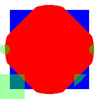
Oh, it looks like the alpha channel is ignored during the clear as well. Easy fix, just set the alpha to 0xFF at all times in the clear color.
color = color.with_alpha(1.0);
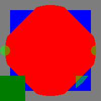
You may notice that this image is tiny. That’s because it’s the only one that worked. Since we set up the clear() function to ignore scale and transform, we then find that the other samples, which we’d previously handled by scaling up the context, are now ignoring that scale.
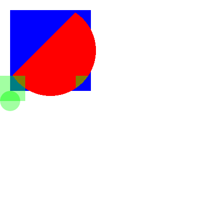
The easiest way to fix this is to just add a second, hidden scale to the context that the clear function respects. I hope you, the reader, don’t blame me if I’ve lost patience for anything other than the easy way.
// Create a piet-glow render context.
let mut rc = unsafe { context.render_context(scaled_width, scaled_height) };
piet::RenderContext::text(&mut rc).set_dpi(72.0);
rc.set_bitmap_scale(scale);

There we are!
Unfortunately it seems like piet-wgpu is broken in a different way.
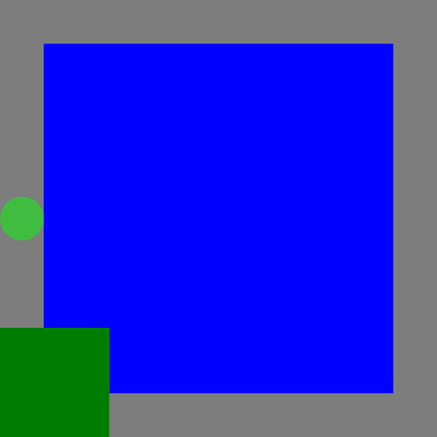
After some trial and error, I’ve found the issue. Apparently the mask texture was being overwritten in a way that OpenGL’s textures weren’t while the textures were being drawn. Whoops. I fix this by having it mark used textures as “used” so they aren’t overwritten at all.
Let’s see what happens.

Ah, nothing. Let me check the shade- oh there’s the issue.
Here’s what I did:
out.mask_coords = vec2<f32>(
    vert.tex_coords.x / uniforms.viewport_size.x,
    vert.tex_coords.y / uniforms.viewport_size.y,
);
However, the mask coordinates should be based on the geometric position of the vertex, not the texture coordinates. This is because the mask is applied to the entire image, not just the texture. I fix this by changing the code to this:
out.mask_coords = vec2<f32>(
    pos.x / uniforms.viewport_size.x,
    pos.y / uniforms.viewport_size.y,
);

There we go!
Number 16: Capture Image Catastrophe
This sample is used to test the capture_image_area function, which captures an area currently visible on the window and returns it as an image. This image can then be used in draw_image calls later on.
If you know about GPU architecture, you know that this is hard to do on the GPU. Generally, GPU’s are optimized for writing, not reading. So if you read, you have to wait for the GPU to finish writing, which is slow.
Here is the reference image from piet-cairo:
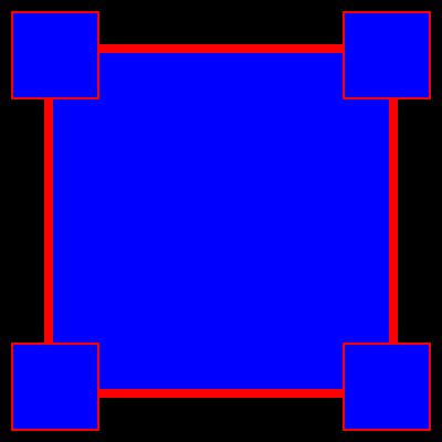
Here is the version from piet-glow:

No, you’re seeing that right. That’s just a black box.
The logs indicate what the issue is:
2023-07-30T18:22:44.464345Z ERROR test_picture_glow::util::glutin_impl: Error-1 (API): GL_INVALID_OPERATION in glReadPixels(multisample FBO)
2023-07-30T18:22:44.464381Z ERROR piet_glow: GL error: GL_INVALID_OPERATION
Ah, we can’t call glReadPixels on a multisample framebuffer. As I mentioned in Part 1, we’re using multisample framebuffers to get antialiasing. What happens if we disable that, just for this sample?
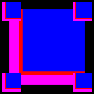
Well, it’s a start.
Curiously, if I use a scale of 1.0, the image renders properly, indicating that it’s a problem with my scaling code.

Oh wait, I forgot to set the scale on the rectangle I read from. That’s an easy fix.

It works!
Sample 0: Back to Basics
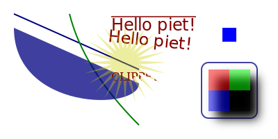
Let’s circle all the way back around to where it all began. Sample 0 is a test of many things, such as clipping, blurred rectangles and more. Since it involved text rendering and clipping masks, I skipped it the first time around. Now, I’m going to tackle it.
Here is the reference image from piet-cairo:
Here is the version from piet-glow:
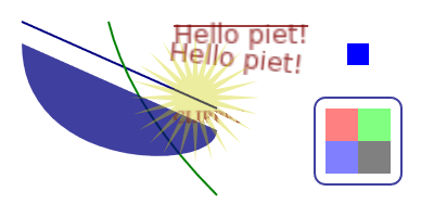
Nice! There are only two real issues I can see here:
- The text is too blurry… but that’s not really too big of an issue.
- The blurred rectangle isn’t rendering. I left it unimplemented because I didn’t know how to do it. After copying some code from my own
piet-tiny-skiacrate, it works now.
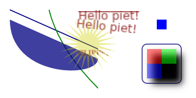
Speaking of piet-tiny-skia, after all the work I’ve put into these crates, it was actually pretty easy to just set up in a few hours. That’s what I love about programming; once things start getting good, they keep getting better.
The Rejects
Speaking of things getting better, I figure I should have a list of what I decided not to do. Partly because solving it is out of my wheelhouse for the time being, and partly because I’ve had my fill of text rendering shenanigans for all of 2023.
I’ve decided to skip samples 11, 12, 13 and 14. I feel like they’re not entirely essential for rendering. They can be fixed later, I’d say.
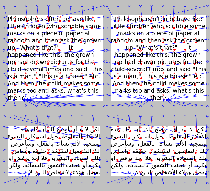
Sample 11 is here to demonstrate text hit testing, which is used to determine where you out the cursor in a text editor, among other things. Here’s piet-cairo’s sample:
Here’s piet-glow’s:
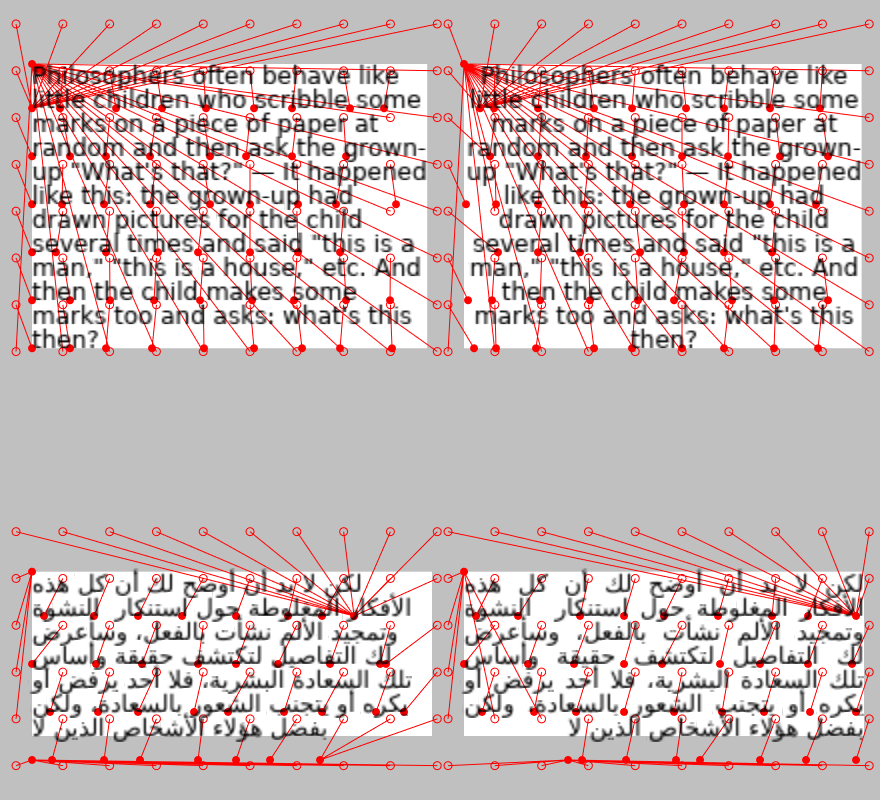
I was using cosmic-text’s “hit” functionality to test this, which apparently reports a hit no matter what. I should go back and write my own hit-testing function, but that’s a lot of work for a little gain, so I’m going to skip it for now.
Also, it looks like some text is improperly hit-tested at index 0? Not sure about that.
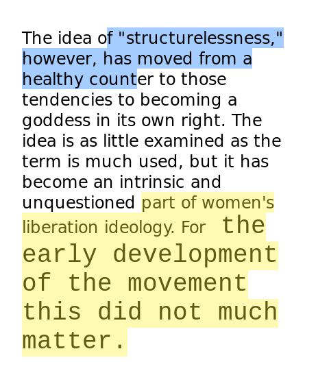
Sample 12 demonstrates the “text rectangles” functionality, which is used for highlighting text. I guess that’s actually kind of important, but it depends on hit testing, and as stated above hit testing is off the table for now. Here’s piet-cairo’s sample:
Here’s piet-glow’s:
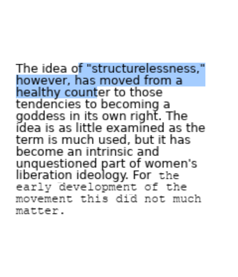
Aside from the font size variation, it actually works for the first part that’s highlighted. I’m not sure why the second part isn’t highlighted, but it’s probably related to how the text is hit-tested. I’ll focus on this later.
Sample 13 demonstrates… I don’t know, I forget, something text-related. Here’s piet-cairo’s sample:
Here’s piet-glow’s:
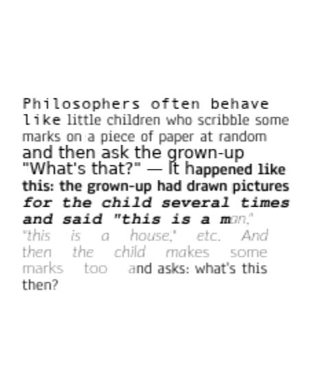
Aside from the other issues mentioned earlier (blurry text, weird font justification), overall this looks like it’s working as intended.
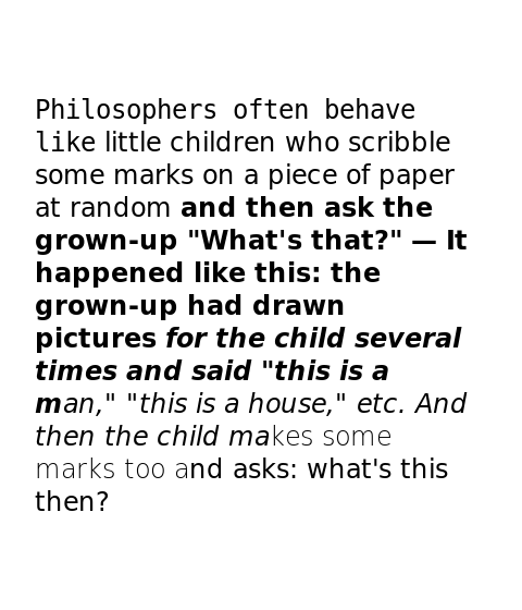
Sample 14 demonstrates text weight and boldness. Here’s piet-cairo’s sample:
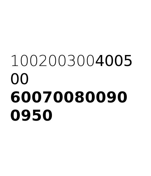
Here’s piet-glow’s:
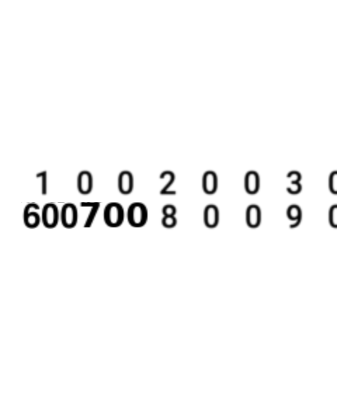
I don’t even know where to start. I think the text spacing issue is just justification problems. The boldness, I don’t even want to start on.
Conclusions
What did I learn from this? I couldn’t tell you. Mostly just how not to do graphics. Some appreciation for the efforts of projects like cairo and Skia to make graphics easy. Oh well, at the end of this, I have a nice little product.
theo, coming soon to a crates.io near you!
